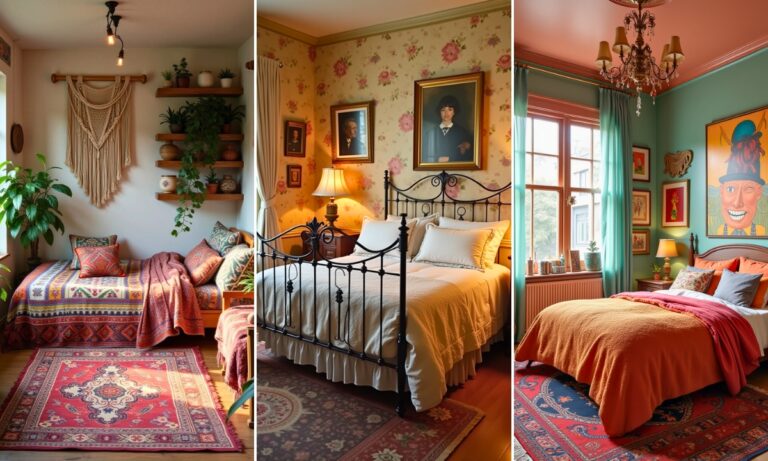
29 Bedroom Color Ideas That Don’t Look Like Everyone Else’s Pinterest Board
I painted my bedroom “greige” four different times before I admitted the problem wasn’t the paint, it was that I kept picking colors because they were safe, not because I actually liked them.
The room I have now — a deep, slightly dusty blue-green — gets compliments almost every single time someone sees it, and it’s the least “safe” choice I’ve ever made in this house.
Bedroom color is one of those decisions that feels higher-stakes than it actually is. Paint is reversible. What isn’t reversible is years of waking up in a room that’s technically fine and does nothing for you.
My friend Nora has repainted her bedroom three times in the last five years chasing the right color, and she finally landed on one she says she’ll never change again.
Between her trial and error and mine, here are 29 directions worth actually considering, not just the beige you’d default to.
1. Deep Forest Green
A saturated, almost black-green on the walls makes a bedroom feel genuinely cocooning at night, especially with warm-toned lighting. It’s bolder than most people expect going in, but it reads surprisingly calming once it’s actually on the wall, not just on a swatch.
Pro tip: Test a deep green in both daylight and lamp light before committing — the same can can look almost black in the evening and distinctly green by midday, and you want to like both versions.
2. Dusty Terracotta
A muted, slightly faded terracotta — not the bright orange-red version — brings real warmth without feeling like a dated 2000s accent wall. It pairs especially well with warm wood tones and brass hardware.
3. Muted Sage
Sage green has stayed popular for a reason — it’s soft enough to feel calming but has enough depth that it doesn’t read as flat or boring the way a plain beige often does.
4. Charcoal With White Trim
A genuinely dark charcoal wall color, kept sharp against crisp white trim and ceiling, creates a dramatic, hotel-like feel that photographs beautifully and still feels restful once the lights are low.
5. Warm Butter Yellow
Not a bright, saturated yellow — a soft, warm, almost cream-adjacent yellow that brings genuine cheerfulness to a room without being overwhelming, especially in a space that doesn’t get much natural light.
| Color Direction | Mood | Best For |
|---|---|---|
| Deep forest green | Cocooning, moody | North-facing, larger rooms |
| Dusty terracotta | Warm, grounded | Rooms with wood furniture |
| Muted sage | Calming, soft | Most light conditions |
| Charcoal + white trim | Dramatic, polished | Rooms with good natural light |
| Warm butter yellow | Cheerful, cozy | Low-light or small rooms |
6. Dusty Lavender
A greyed-down, muted lavender avoids the overly sweet or childish feeling a brighter purple can bring, while still adding genuine color and softness to the room.
7. Deep Navy
Navy walls remain one of the most reliable dark color choices for a bedroom specifically — it reads sophisticated rather than cave-like, especially layered with warm lighting and natural textures like linen or wood.
8. Warm Taupe, Not Grey Taupe
If you want a neutral but the cool greys of the last decade feel tired, a warm, slightly pink-leaning taupe gives you the same versatility with noticeably more warmth and personality.
9. Clay Pink
A dusty, muted clay pink — closer to earthy than sweet — has become a genuine go-to for bedrooms specifically because it reads sophisticated rather than overtly “pink,” even to people who’d normally avoid pink entirely.
10. Deep Burgundy
A rich, wine-toned burgundy on the walls is a bold, confident choice that works especially well in a room with good trim detail and layered textiles — it genuinely reads as luxurious rather than overwhelming once furnished properly.
11. Soft Olive
Slightly more muted and earthy than a standard sage, olive brings depth and a grounded, almost outdoorsy warmth that pairs beautifully with brass, rattan, and warm wood tones.
12. Warm Off-White With a Textured Finish
If a full color commitment isn’t where you’re at, a warm off-white in a textured or limewash-style finish adds visual interest and depth without the risk of a bold saturated color.
13. Slate Blue-Grey
Somewhere between blue and grey, slate is calming without tipping into cold, and it’s genuinely one of the most versatile color choices for pairing with both warm and cool-toned furniture.
14. Deep Plum
A darker, more purple-leaning cousin of burgundy, deep plum brings drama and warmth at once, and it’s especially striking against brass fixtures or gold-framed mirrors.
15. Warm Camel
A rich, warm camel — closer to a deep tan than a true neutral — brings a genuinely cozy, enveloping feeling, especially effective in a room with lower ceilings where a dark color might otherwise feel heavy.
16. Two-Tone Walls, Split at Chair Rail Height
Rather than committing to a single bold color on every wall, a two-tone approach — a darker or bolder shade on the bottom half, a lighter neutral above — lets you experiment with a more dramatic color while keeping the room feeling balanced.
17. Rich Chocolate Brown
Deep, warm browns have made a genuine comeback in bedroom design specifically, reading as cozy and grounded rather than dated, especially paired with cream bedding and warm lighting.
18. Soft Periwinkle
A muted blue-purple, periwinkle brings a dreamy, slightly nostalgic quality without feeling overly sweet, and it works well in rooms that want color without going fully dark or saturated.
19. Deep Teal
Teal sits in that useful space between blue and green, and a deep, saturated version makes for a genuinely striking, moody bedroom color that still photographs well in natural light.
20. Warm Blush, Dialed Down
A very muted, almost beige-adjacent blush gives a soft, warm undertone to a room without reading as distinctly “pink” the way a brighter blush might, making it an easy color for shared or guest spaces too.
21. Moody Aubergine
A dark, slightly brown-leaning purple, aubergine brings real depth and richness and pairs especially well with gold accents and warm wood furniture for a genuinely luxe feel.
22. Soft Sky Blue
A lighter, more classic sky blue remains a reliable, calming choice, especially in rooms meant primarily for rest rather than drama — it’s the color equivalent of a deep breath.
23. Warm Grey With Beige Undertones
If pure grey has always felt a little cold, a warm grey with visible beige undertones gives you the same neutral flexibility with a noticeably cozier feel in person.
24. Deep Rust
A richer, more saturated cousin of terracotta, deep rust is a bold but genuinely warm choice that pairs beautifully with denim blues and warm wood tones for an unexpectedly cohesive palette.
25. Pale Eucalyptus
A soft, slightly grey-green that reads calmer and more muted than a brighter sage, pale eucalyptus is an easy, restful color that works in nearly any lighting condition.
26. Accent Wall in a Bold Color, Neutral Elsewhere
If committing to a full room in a bold color feels like too much, a single accent wall — usually behind the headboard — lets you get the drama of a saturated color without covering every surface in it.
27. Warm Cream With Gold Undertones
A step beyond plain white, a warm cream with visible gold undertones brings subtle richness to a room without reading as a full color commitment, which makes it an easy transitional choice.
28. Deep Indigo
Darker and more purple-leaning than navy, indigo brings genuine drama and depth, especially effective in a room with minimal natural light where a true black-adjacent color might feel too heavy.
29. Choosing Based on How You Actually Use the Room, Not a Trend
The single biggest factor in whether Nora’s third repaint finally stuck wasn’t the color itself — it was finally choosing based on how she actually uses the room (reading in bed most nights, needing it to feel calm rather than energizing) instead of whatever was trending that season. Think about whether your bedroom needs to feel cocooning, airy, dramatic, or restful before you even look at swatches, and let that narrow the list for you.
What I’d Actually Do First
Buy sample pots, not swatches, and paint actual poster-board-sized patches on at least two different walls, then live with them for a few full days across both morning and evening light. The color that still feels right on day four is the one worth committing to — swatches lie more often than people expect.
FAQs
What’s the best bedroom color for better sleep?
Cooler, muted tones — soft blues, sage greens, deep navy — tend to feel more calming for most people, though warmer neutrals and dusty terracottas work just as well if they feel personally soothing to you specifically.
Should I paint my ceiling the same color as my walls?
It depends on ceiling height — a lower ceiling painted the same dark color as the walls can actually make the room feel cozier rather than smaller, while a high ceiling often benefits from staying lighter to keep the room feeling open.
Are dark bedroom colors a bad idea in a small room?
Not necessarily — a small room in a deep, saturated color can feel intentionally cocooning rather than cramped, especially with good lighting and minimal visual clutter elsewhere in the space.
How many paint samples should I test before deciding?
Three to four is usually enough to see real differences without overwhelming yourself — test them in large enough patches, and in both daylight and lamp light, before narrowing it down further.

Hi, I’m Ashley Miller, a wife, a busy mom, and someone who loves to share all the things that make life a little more fun and beautiful.
From easy DIY projects, delicious recipes, and chic hairstyles to nail ideas and home decor tips, I share everything I’ve learned and love.
My goal is to inspire other women to explore their creativity and make their homes even more special.