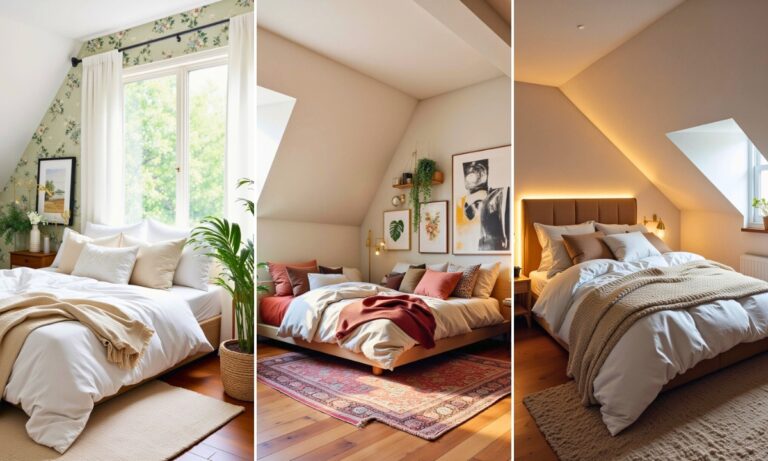
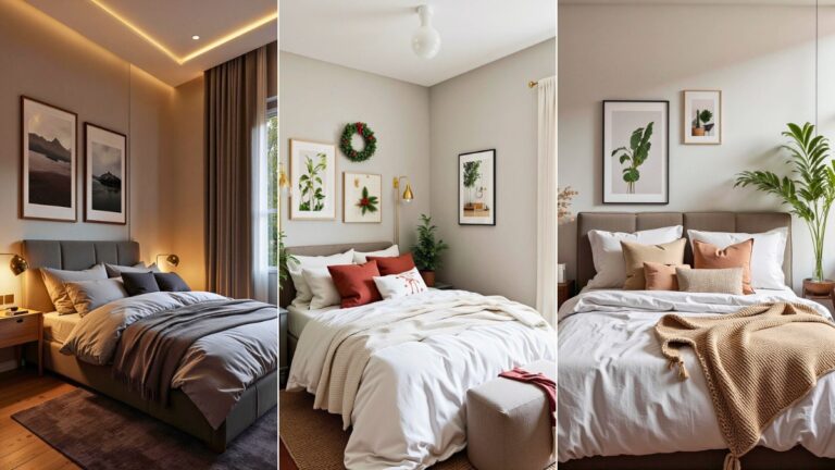
20 Bedroom Gallery Wall Layout Ideas That Instantly Make Your Room Look Styled, Personal, and Totally Intentional
Ever look at your bedroom wall and think, “Yep… that wall is definitely judging me”? Same. I lived with blank walls for way too long because gallery walls felt confusing, expensive, or like something only interior designers pull off.
Turns out, they’re way more forgiving than we think. You just need a smart layout and a bit of confidence.
Let’s talk bedroom gallery wall layout ideas that actually work in real homes with real budgets. No perfection required. Just good vibes, personality, and walls that finally pull their weight.
1. The Classic Grid Layout (AKA The Safety Net)
This layout never fails. If you like things neat, calm, and visually soothing, start here.
A grid gallery wall uses frames that line up evenly in rows and columns. Everything feels balanced, which makes your brain relax instantly. I used this layout above my bed, and honestly, it felt like the room finally exhaled.
Why it works so well:
- Keeps visual noise low
- Looks intentional even with simple art
- Perfect for minimal or modern bedrooms
Ever wondered why designers love grids so much? Control. Pure, beautiful control.
2. The Organic Freeform Layout (Messy But Make It Art)
This layout ignores rules, vibes hard, and somehow still looks amazing.
A freeform gallery wall mixes frame sizes, spacing, and orientation. You anchor one main piece and build around it intuitively. IMO, this works best when you want your wall to feel personal, not curated for Instagram.
Tips to keep it from looking chaotic:
- Stick to a tight color palette
- Mix large and small frames intentionally
- Space pieces closer than you think
Yes, you will second-guess yourself mid-installation. Power through.
3. Over-the-Bed Horizontal Strip
This layout works wonders if your bed wall feels empty but tall gallery walls overwhelm you.
You hang frames in a long horizontal line above the headboard. Everything feels grounded and clean, and your bed stays the focal point. I love this for smaller bedrooms where vertical space already feels tight.
Best for:
- Low ceilings
- Wide beds
- Calm, cozy bedrooms
Simple layouts often win, FYI.
4. Vertical Column for Small Bedrooms
If floor space feels tight, go vertical.
A vertical gallery wall layout draws the eye upward and makes the room feel taller. You stack frames in a single column or narrow cluster, usually beside the bed or near a window.
Why it’s genius:
- Makes ceilings look higher
- Uses awkward narrow wall sections
- Looks sleek and intentional
Small room problems demand smart solutions.
5. The Statement Centerpiece Layout
This layout starts with one bold piece and builds out from there.
You hang one large artwork first, then surround it with smaller frames. I used a massive abstract print once, and the wall suddenly felt expensive even though most frames came from discount bins.
Key rule:
Make the centerpiece impossible to ignore. Everything else supports it.
6. Symmetrical Twin Layout
Symmetry lovers, this one’s for you.
You mirror frames on both sides of a central point, usually over the bed. The layout feels calm, structured, and hotel-level polished. I swear symmetry makes bedrooms feel more restful.
Works best when:
- You use matching frames
- The art styles stay similar
- The bed sits centered on the wall
Yes, symmetry feels a bit serious, but it sleeps well.
7. Gallery Wall With Mixed Media
Who said gallery walls only need prints?
Mix photos, textiles, mirrors, sketches, and objects for a layered look. I added a small woven piece once, and it instantly made the wall feel warmer.
Good mixed-media options include:
- Fabric wall art
- Tiny shelves
- Decorative plates or mirrors
Your wall should reflect you, not a catalog.
8. Corner Gallery Layout
Corners feel awkward until you claim them.
This layout wraps art around a corner, connecting two walls visually. It works beautifully next to beds or reading nooks and makes the room feel intentional instead of boxy.
Ever notice how ignored corners kill room flow? This fixes that.
9. Black Frame Minimalist Layout
Black frames equal instant cohesion.
You can mix different art styles, sizes, or themes, but black frames tie everything together. I swear this trick saved me from a chaotic gallery wall situation :/
Why it works:
- Creates instant consistency
- Works with any color palette
- Looks sleek without trying too hard
Easy win.
10. Color-Coordinated Gallery Wall
This layout uses color as the unifying element.
You choose artwork that shares similar tones, even if the styles differ. The result feels cohesive but playful. I once leaned into warm neutrals, and my bedroom suddenly felt calmer.
Color coordination matters more than matching frames.
11. Shelf-Based Gallery Wall
If commitment scares you, add shelves.
Floating shelves let you lean art instead of hanging everything. You can swap pieces out anytime without patching holes. I rearrange mine way too often, but no regrets.
Shelf styling tips:
- Layer frames front to back
- Mix art heights
- Add one small object for balance
Flexibility feels good.
12. Photo-Focused Gallery Wall
This one leans heavy on personal photos.
Travel shots, family moments, random memories, all together in one place. I love waking up to photos that actually mean something.
To avoid clutter:
- Keep editing consistent
- Use similar frame styles
- Stick to a loose layout plan
Your life deserves wall space.
13. Monochrome Art Layout
This layout looks bold and timeless.
You use artwork in black, white, and gray tones only. Everything feels intentional and slightly dramatic. IMO, this works beautifully in modern or minimalist bedrooms.
Monochrome removes decision fatigue instantly.
14. The Stair-Step Layout
This layout climbs visually.
Frames rise diagonally up the wall, like steps. It feels dynamic and works well beside beds or dressers. I tried this once and loved how it added movement without chaos.
Movement matters, especially in static spaces.
15. The Dense Salon-Style Wall
Maximalists, I see you.
This layout packs art tightly, almost touching. It feels bold, creative, and full of personality. I wouldn’t recommend it for small bedrooms unless you love visual energy.
Make it work by:
- Keeping a limited color palette
- Mixing frame styles confidently
- Filling space intentionally
Controlled chaos still counts as control.
16. Minimal Trio Layout
Sometimes three is plenty.
A set of three frames above the bed or dresser feels balanced and clean. I use this layout when I want the room calm, not chatty.
Why it works:
- Easy to install
- Impossible to mess up
- Looks thoughtful, not empty
Less effort, same payoff.
17. Gallery Wall Around a Mirror
Mirrors change everything.
You center a mirror and surround it with art. The mirror adds light, depth, and function. I swear this layout makes bedrooms feel twice as bright.
Function plus style always wins.
18. Tall Gallery Wall Behind a Headboard
This layout fills vertical space beautifully.
You stack frames from just above the headboard toward the ceiling. It creates drama without overpowering the bed. I love this for rooms with tall walls that feel cold.
Vertical art warms tall spaces fast.
19. Frame-Mat Focused Layout
Mats don’t get enough credit.
Using thick or matching mats creates consistency even when art styles vary. I learned this the hard way after swapping mats once and instantly loving my wall again.
Details matter more than you think.
20. The Evolving Gallery Wall
This layout grows with you.
You leave room to add pieces over time. I started with five frames and slowly built up as I found things I loved. No rush, no pressure.
Your bedroom shouldn’t feel finished forever. Growth looks good on walls.
Final Thoughts: Your Wall, Your Rules
Gallery walls don’t need perfection, permits, or a design degree. They need confidence, intention, and a layout that fits your space. Every idea here works because it adapts to real bedrooms and real lives.
So ask yourself this: do you want calm, bold, personal, or playful? Pick a direction, commit, and trust yourself. Your bedroom will thank you, and that judgmental blank wall will finally chill out.
Now go hang something. Seriously.

Hi, I’m Ashley Miller, a wife, a busy mom, and someone who loves to share all the things that make life a little more fun and beautiful.
From easy DIY projects, delicious recipes, and chic hairstyles to nail ideas and home decor tips, I share everything I’ve learned and love.
My goal is to inspire other women to explore their creativity and make their homes even more special.

